why kids should map places

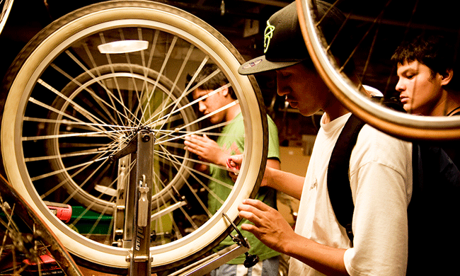
Middle school kids in Nashville Tennessee have been successful in getting new bike infrastructure because of their mapping efforts.  Araz Hachadourian, reported in YES! magazine  that ‘Nashville Teens Mapped Their Daily Routes—And Got a New Bike Lane as a Result. In Nashville, Tennessee, and Chicago, city planners are responding to demands for better neighborhood mobility and bicycling infrastructure.

wheeltrue
Photo by Gabriela Aguirre-Iriarte

And it makes sense that planners would respond more strongly to kids…and I bet they’d respond even more strongly to younger kids who get involved in mapping the needs of their neighbourhoods and towns.


road paved with solar panels

Where’s one place that we have a lot of available flat space? Road surfaces. A village in France is experimenting by putting solar panels on their roads. The solar panels are supposed to be tough enough to drive on. The village experiment will determine how tough these solar panels really are. (reported in Inhabitat). The 1km of road paved with solar panels should power streetlighting for the village.

Waterway solar panel road surface

The road is by a French company called Wattway. The company says:

The world’s 1st ever photovoltaic road surface
Wattway is a patented French innovation that is the fruit of 5 years of research undertaken by Colas, world leader in transport infrastructure, and the INES (French National Institute for Solar Energy).

superhero prosthetics by kids, for kids

superheroarm

The Superhero Cyborgs program, run by KIDmob and Autodesk, invited 10-year old Jordan to design and build her prosthetic super hero arm.

FastCompany writes:

“The program connects children with upper-limb differences with professional engineers so that they can design and create their own custom-made prosthetics that do, well, whatever the kids want them to do.”

In the case of Jordan, that arm was a glitter cannon. Read more at Fast Company.

New ways to look at the world

Last week we looked at low tech ways to take aerial photographs–creating local maps, if you will. This week we’re looking at a different kind of mapping tool. Worldmapper has a tag line of “The world as you’ve never seen it.” And I’m sure you and the kids will agree. We are all familiar with standard maps of the world, such as the one below:

450 worldmap

map courtesy of Perhelion on creative commons wikimedia

Worldmapper works by distorting this map according to relative sizes of  some specific category. For example, this map shows airline miles travelled according to “the proportion of all kilometres flown around the world by aircraft that were registered there.”

worldmapper-air

So we can see pretty clearly that countries like Africa (red and orange) are contributing very few air miles, whereas the US and Europe contribute the most. What about Japan? India? Canada? Can you spot them?

Here’s another example, people who live in overcrowded homes. In this map, “Territory size shows the proportion of all people that live in overcrowded homes worldwide that live there.”

overcrowding2

In the notes for this map, Worldmapper comments, “Overcrowding is defined here as when there are more than two people for each room in the house. The populations of richer territories experience less overcrowding, than those in poorer territories. Living in large groups is also connected to social and cultural norms. In India 77% of the population live in conditions that are considered to be overcrowded.”

We can see the big statistic for India appear on the map as the bulging yellow area. Meanwhile in the US and Europe there is relatively little overcrowding. What else can you see about overcrowding?

When you visit Worldmapper you can view a range of map categories covering housing, income, transport, health, disease, and many more. The project shows some interesting ideas for how we design our information display.